<!-- title: "Kubernetes visualizations" description: "Netdata Cloud features rich, zero-configuration Kubernetes monitoring for the resource utilization and application metrics of Kubernetes (k8s) clusters." custom_edit_url: "https://github.com/netdata/netdata/blob/master/docs/cloud/visualize/kubernetes.md" sidebar_label: "Kubernetes visualizations" learn_status: "Published" learn_topic_type: "Concepts" learn_rel_path: "Operations/Visualizations" --> # Kubernetes visualizations Netdata Cloud features enhanced visualizations for the resource utilization of Kubernetes (k8s) clusters, embedded in the default [Overview](https://github.com/netdata/netdata/blob/master/docs/cloud/visualize/overview.md) dashboard. These visualizations include a health map for viewing the status of k8s pods/containers, in addition to composite charts for viewing per-second CPU, memory, disk, and networking metrics from k8s nodes. See our [Kubernetes deployment instructions](https://github.com/netdata/netdata/blob/master/packaging/installer/methods/kubernetes.md) for details on installation and connecting to Netdata Cloud. ## Available Kubernetes metrics Netdata Cloud organizes and visualizes the following metrics from your Kubernetes cluster from every container: - `cpu_limit`: CPU utilization as a percentage of the limit defined by the [pod specification `spec.containers[].resources.limits.cpu`](https://kubernetes.io/docs/concepts/configuration/manage-resources-containers/#resource-requests-and-limits-of-pod-and-container) or a [`LimitRange` object](https://kubernetes.io/docs/tasks/administer-cluster/manage-resources/cpu-default-namespace/#create-a-limitrange-and-a-pod). - `cpu`: CPU utilization of the pod/container. 100% usage equals 1 fully-utilized core, 200% equals 2 fully-utilized cores, and so on. - `cpu_per_core`: CPU utilization averaged across available cores. - `mem_usage_limit`: Memory utilization, without cache, as a percentage of the limit defined by the [pod specification `spec.containers[].resources.limits.memory`](https://kubernetes.io/docs/concepts/configuration/manage-resources-containers/#resource-requests-and-limits-of-pod-and-container) or a [`LimitRange` object](https://kubernetes.io/docs/tasks/administer-cluster/manage-resources/cpu-default-namespace/#create-a-limitrange-and-a-pod). - `mem_usage`: Used memory, without cache. - `mem`: The sum of `cache` and `rss` (resident set size) memory usage. - `writeback`: The size of `dirty` and `writeback` cache. - `mem_activity`: Sum of `in` and `out` bandwidth. - `pgfaults`: Sum of page fault bandwidth, which are raised when the Kubernetes cluster tries accessing a memory page that is mapped into the virtual address space, but not actually loaded into main memory. - `throttle_io`: Sum of `read` and `write` per second across all PVs/PVCs attached to the container. - `throttle_serviced_ops`: Sum of the `read` and `write` operations per second across all PVs/PVCs attached to the container. - `net.net`: Sum of `received` and `sent` bandwidth per second. - `net.packets`: Sum of `multicast`, `received`, and `sent` packets. When viewing the [health map](#health-map), Netdata Cloud shows the above metrics per container, or aggregated based on their associated pods. When viewing the [composite charts](#composite-charts), Netdata Cloud aggregates metrics from multiple nodes, pods, or containers, depending on the grouping chosen. For example, if you group the `cpu_limit` composite chart by `k8s_namespace`, the metrics shown will be the average of `cpu_limit` metrics from all nodes/pods/containers that are part of that namespace. ## Health map The health map places each container or pod as a single box, then varies the intensity of its color to visualize the resource utilization of specific k8s pods/containers. 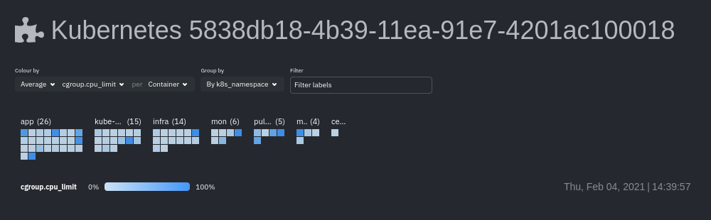 Change the health map's coloring, grouping, and displayed nodes to customize your experience and learn more about the status of your k8s cluster. ### Color by Color the health map by choosing an aggregate function to apply to an [available Kubernetes metric](#available-kubernetes-metrics), then whether you to display boxes for individual pods or containers. The default is the _average, of CPU within the configured limit, organized by container_. ### Group by Group the health map by the `k8s_cluster_id`, `k8s_controller_kind`, `k8s_controller_name`, `k8s_kind`, `k8s_namespace`, and `k8s_node_name`. The default is `k8s_controller_name`. ### Filtering Filtering behaves identically to the [node filter in War Rooms](https://github.com/netdata/netdata/blob/master/docs/cloud/war-rooms.md#node-filter), with the ability to filter pods/containers by `container_id` and `namespace`. ### Detailed information Hover over any of the pods/containers in the map to display a modal window, which contains contextual information and real-time metrics from that resource. 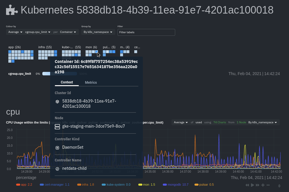 The **context** tab provides the following details about a container or pod: - Cluster ID - Node - Controller Kind - Controller Name - Pod Name - Container - Kind - Pod UID This information helps orient you as to where the container/pod operates inside your cluster. The **Metrics** tab contains charts visualizing the last 15 minutes of the same metrics available in the [color by option](#color-by). Use these metrics along with the context, to identify which containers or pods are experiencing problematic behavior to investigate further, troubleshoot, and remediate with `kubectl` or another tool. ## Composite charts The Kubernetes composite charts show real-time and historical resource utilization metrics from nodes, pods, or containers within your Kubernetes deployment. See the [Overview](https://github.com/netdata/netdata/blob/master/docs/cloud/visualize/overview.md#definition-bar) doc for details on how composite charts work. These work similarly, but in addition to visualizing _by dimension_ and _by node_, Kubernetes composite charts can also be grouped by the following labels: - `k8s_cluster_id` - `k8s_container_id` - `k8s_container_name` - `k8s_controller_kind` - `k8s_kind` - `k8s_namespace` - `k8s_node_name` - `k8s_pod_name` - `k8s_pod_uid` 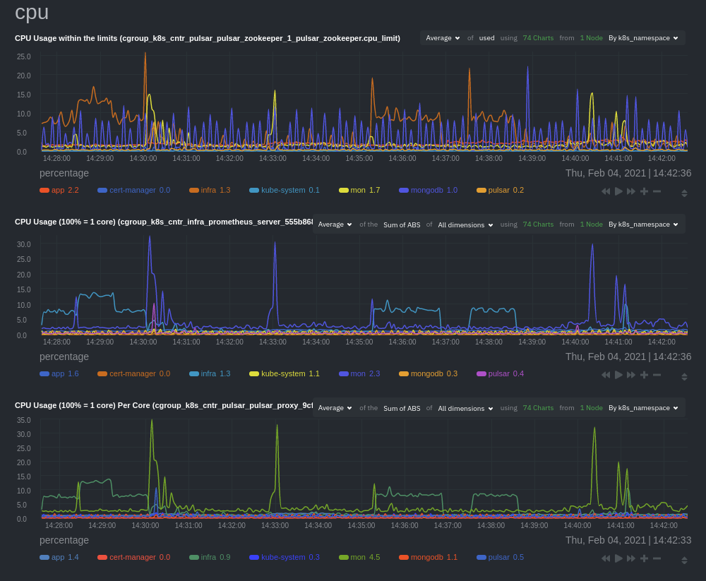 In addition, when you hover over a composite chart, the colors in the heat map changes as well, so you can see how certain pod/container-level metrics change over time. ## Caveats There are some caveats and known issues with Kubernetes monitoring with Netdata Cloud. - **No way to remove any nodes** you might have [drained](https://kubernetes.io/docs/tasks/administer-cluster/safely-drain-node/) from your Kubernetes cluster. These drained nodes will be marked "unreachable" and will show up in War Room management screens/dropdowns. The same applies for any ephemeral nodes created and destroyed during horizontal scaling.