mirror of
https://github.com/netdata/netdata.git
synced 2025-05-02 08:20:10 +00:00
79 lines
3.6 KiB
Text
79 lines
3.6 KiB
Text
---
|
|
title: "Select timeframes to visualize"
|
|
description: "Netdata's dashboard features a rich timeframe selector, with useful defaults and rich customization, to help you narrow your focus when troubleshooting issues or anomalies."
|
|
type: how-to
|
|
custom_edit_url: https://github.com/netdata/netdata/edit/master/docs/dashboard/select-timeframes.mdx
|
|
---
|
|
|
|
# Pick timeframes to visualize
|
|
|
|
While [panning through time and zooming in/out](/docs/dashboard/interact-charts.mdx) from charts is helpful when
|
|
you're looking a recent history, or want to do granular troubleshooting, what if you want to see metrics from 6 hours
|
|
ago? Or 6 days?
|
|
|
|
Netdata's dashboard features a **timeframe selector** to help you visualize specific timeframes in a few helpful ways.
|
|
By default, it shows a certain number of minutes of historical metrics based on the your browser's viewport to ensure
|
|
it's always showing per-second granularity.
|
|
|
|
## Open the timeframe selector
|
|
|
|
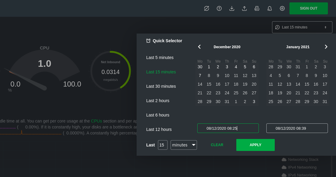
To visualize a new timeframe, you need to open the picker, which appears just above the menu, near the top-right cover
|
|
of the dashboard.
|
|
|
|
|
|
|
|
The **Clear** button resets the dashboard back to its default state based on your browser viewport, and **Apply** closes
|
|
the picker and shifts all charts to the selected timeframe.
|
|
|
|
## Use the Quick Selector
|
|
|
|
Click any of the following options in the **Quick Selector** to choose a commonly-used timeframe.
|
|
|
|
- Last 5 minutes
|
|
- Last 15 minutes
|
|
- Last 2 hours
|
|
- Last 6 hours
|
|
- Last 12 hours
|
|
|
|
Click **Apply** to see metrics from your selected timeframe.
|
|
|
|
## Choose a specific interval
|
|
|
|
Beneath the Quick Selector is an input field and dropdown you use in combination to select a specific timeframe of
|
|
minutes, hours, days, or months. Enter a number and choose the appropriate unit of time, then click **Apply**.
|
|
|
|
## Choose multiple days
|
|
|
|
Use the calendar to select multiple days. Click on a date to begin the timeframe selection, then an ending date. The
|
|
timeframe begins at noon on the beginning and end dates. Click **Apply** to see your selected multi-day timeframe.
|
|
|
|
## Caveats and considerations
|
|
|
|
**Longer timeframes will decrease metrics granularity**. At the default timeframe, based on your browser viewport, each
|
|
"tick" on charts represents one second. If you select a timeframe of 6 hours, each tick represents the _average_ value
|
|
across a larger period of time.
|
|
|
|
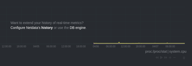
**You can only see metrics as far back in history as your metrics retention policy allows**. Netdata uses an internal
|
|
time-series database (TSDB) to store as many metrics as it can within a specific amount of disk space. The default
|
|
storage is 256 MiB, which should be enough for 1-3 days of historical metrics. If you navigate back to a timeframe
|
|
beyond stored historical metrics, you'll see this message:
|
|
|
|
|
|
|
|
At any time, [configure the internal TSDB's storage capacity](/docs/store/change-metrics-storage.md) to expand your
|
|
depth of historical metrics.
|
|
|
|
## What's next?
|
|
|
|
<!-- We recommend you dive deeper into some additional dashboard features, such as [import/exporting
|
|
snapshots](/docs/dashboards/import-export-snapshots.mdx) or
|
|
[customization](/docs/dashboards/customize-standard-dashboard.mdx). -->
|
|
|
|
|
|
|
|
### Further reading & related information
|
|
|
|
- [Interact with charts](/docs/dashboard/interact-charts.mdx)
|
|
- [Database engine reference](/database/engine/README.md)
|